How to make your Shopify store look professional
What makes a Shopify store look professional, and how to fix yours: one design direction, two fonts, one accent colour, matching photos, no loose ends.
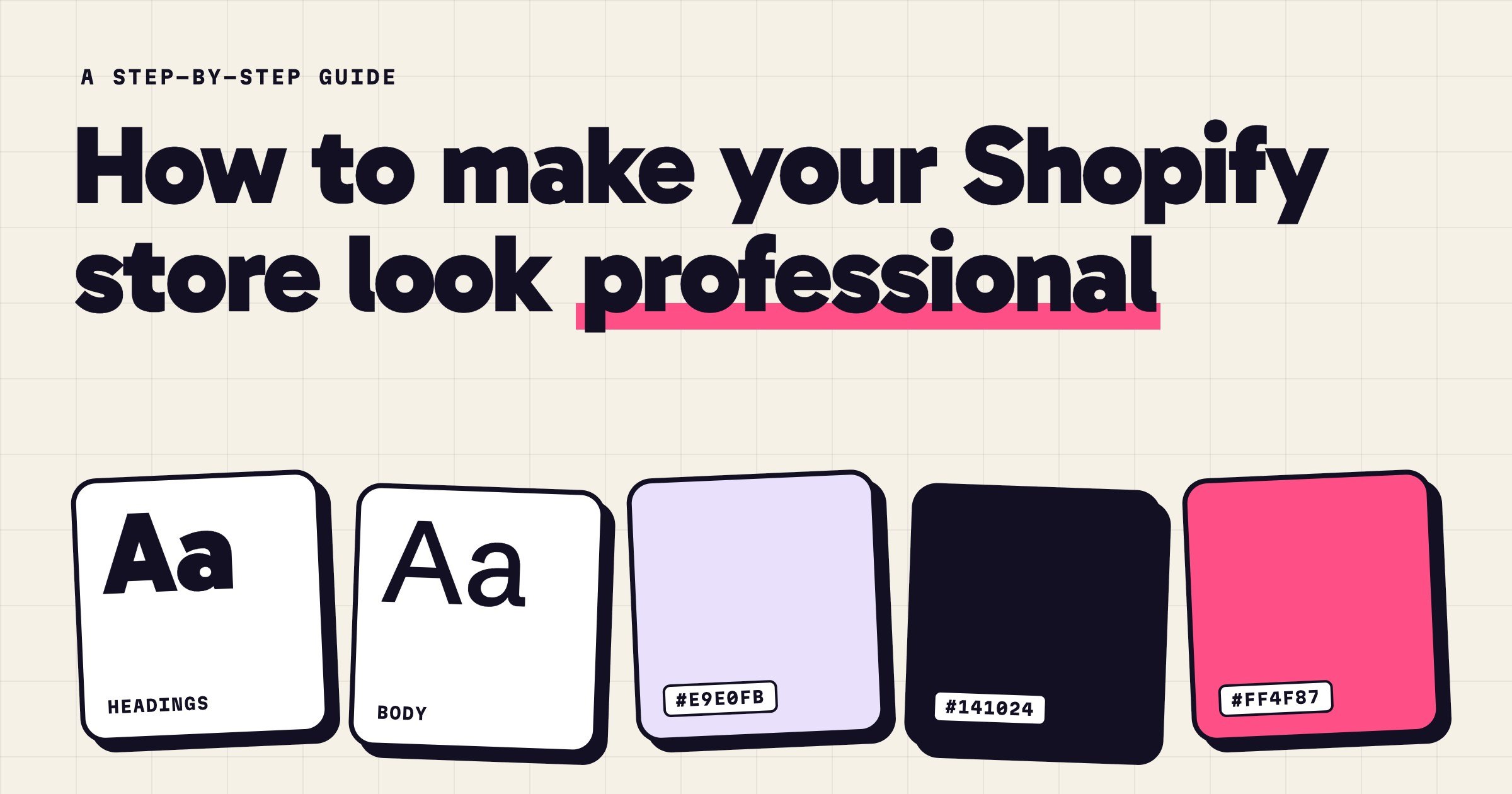
A Shopify store looks professional when every part of it looks like it was decided by the same person. One design direction on every page. Two fonts and one accent colour, used the same way everywhere. Photos that look like they came from one shoot. And no loose ends: no placeholder text, no default pages, no broken links.
None of that needs a designer or an expensive theme. It needs a few decisions, made once and then kept. Shoppers notice when they're not: research on first impressions of websites (Lindgaard and colleagues, 2006) found people form a visual judgement in about 50 milliseconds, long before they read a word.
Our main example is Blunt, a texture paste for short hair, sold in a loud, outlined style, with a few other stores along the way.
Step 1: Pick one design direction, and use it on every page
The fastest way to look amateur is to look like three stores at once: a sleek home page, a product page from a different theme, and an app's cart in its own colours. Shoppers can't name what's wrong, but they feel it.
So pick one direction and hold it. Quiet or loud, warm or clinical: any of them can look professional. Here are four stores in four different design styles, with different products and different colours. None of them is more professional than the others, because each one is consistent with itself:
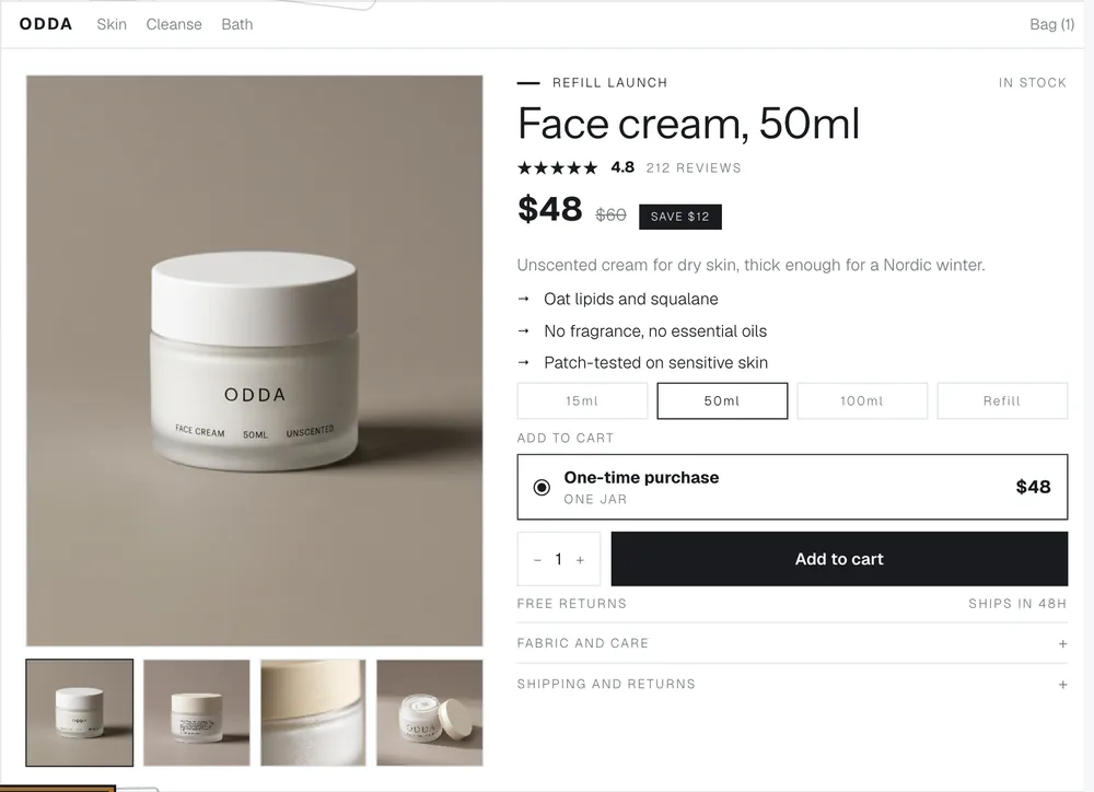
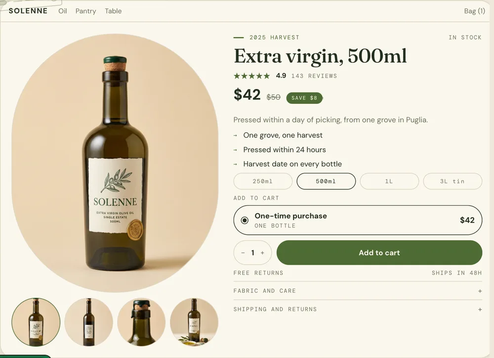
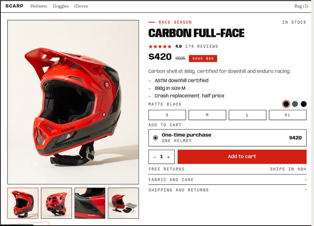
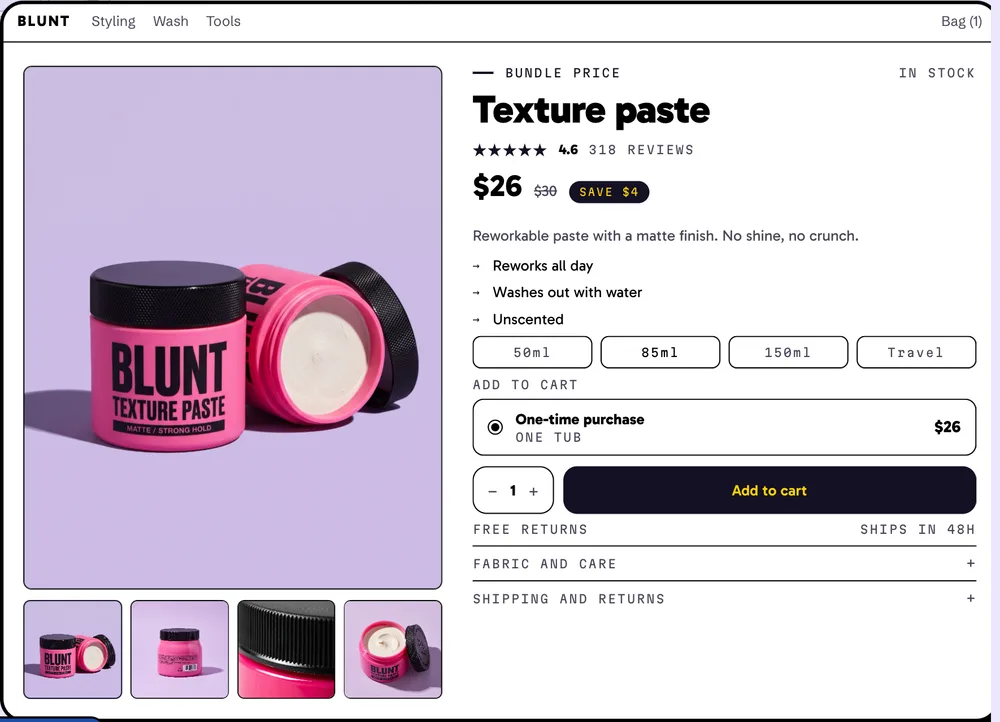
- Two fonts and one accent colour. One font for headings, one for everything else, and one colour for buttons and savings. Look at the four above: each has one button colour, and it isn't spent on decoration.
- The same rules on every page. The product page, the cart, the search results and the 404 page should share the fonts, the colours and the button shape. The pages nobody designs are where a store's look usually falls apart.
- Make apps match. Every app that draws on your store (reviews, upsells, pop-ups) should use your fonts, your colours and your button shape. Most have style settings; use them.
- Keep text readable. Body text needs a contrast ratio of at least 4.5:1 against its background (the WCAG guideline). Light grey on white is the usual failure.
- If you haven't picked a direction yet, the design step of our AI store guide shows how to choose one for your customer.
Step 2: Know whether your product sells on proof or on looks
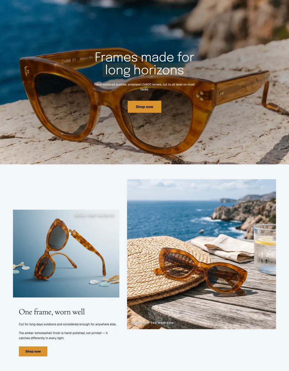
A professional store gives the most room to whatever its shopper is deciding on, and that depends on the product. Someone buying a greens powder wants to know what's in it. Someone buying sunglasses wants to know how they'll look. Here are the top of two real home pages, one from each kind of store:
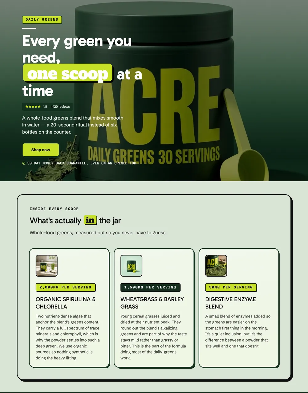
- Things that go in or on the body sell on proof. Supplements, skincare, anything that makes a claim. Put ingredients, doses, testing and reviews near the top, and make them easy to scan. A beautiful page that doesn't answer "what's in it?" looks like it's hiding something.
- Things people wear or show off sell on looks. Clothes, glasses, homeware. Give the photos most of the page: big, from several angles, on a person or in a room. The copy can be short.
- Most products need both, in an order. Decide which one leads at the top of the page, and let the other follow further down.
- A quick test: what would your customer check before paying? If it's a fact, lead with proof. If it's how it looks on them, lead with photos.
Step 3: Make every photo look like it came from the same shoot
Nothing gives a store away faster than mismatched photos: one product on white, one on a kitchen table, one with a supplier's watermark. The products can be great; the store still looks assembled.
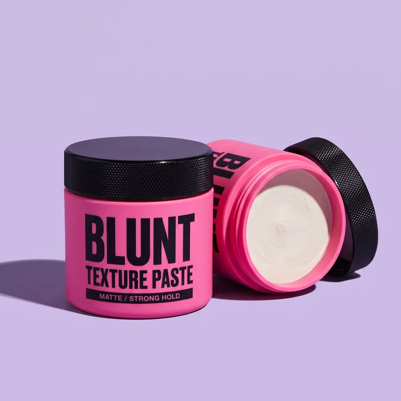
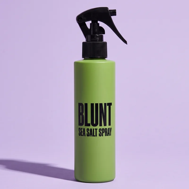
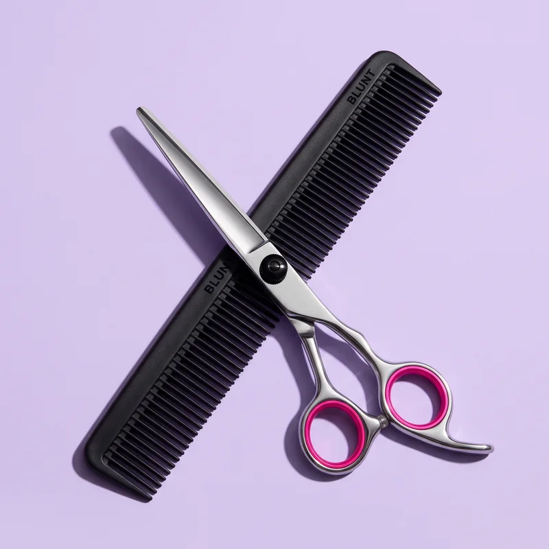 Warm filterBlack and whiteShrunk on white
- One background, one light. Pick a backdrop colour and shoot every product on it, in the same light. A cheap roll of coloured paper and a window beat a mix of stock photos.
- The same crop and angle family. Products at the same size in the frame, from the same height.
- Big and sharp. Shopify recommends square product images at 2048 × 2048 pixels, which stay sharp when shoppers zoom.
- Lifestyle photos follow the same rules. A scene can be different from the studio shots, but it should still carry your colours.
Step 4: Tie up the loose ends
The last 10% is where most stores lose the professional look. Before you launch, go through this list:
- A custom domain. Your own
.com, notyour-store-2.myshopify.com. - A logo and a favicon. The favicon is the small icon in the browser tab; Shopify shows its own if you don't set one.
- No placeholder text. Search your theme for "Lorem ipsum", "Your brand", "Collection title" and "Add a description".
- Real policies. Refund, shipping, privacy and terms pages, filled in and linked from the footer. Shoppers do read the returns policy before buying.
- A way to reach you. A contact page, and an email address on your own domain.
- One price format. "$26" or "$26.00", everywhere, not both.
- No broken links. Click every menu item and footer link once.
- Your own checkout colours and logo. In Shopify, the checkout can carry your logo, colours and fonts, so the last page matches the rest.
Then check it on a phone
Most visits to a small Shopify store come from phones, so a store that only looks professional on a laptop doesn't. Check yours in Analytics, under sessions by device type. Then open your store on your own phone and buy something, start to finish: look for text that's too small, buttons too close together, and anything that makes you pinch to zoom.
Do it again every time you change the theme or add an app. Once a store looks professional, it takes very little to undo it.
Or: start from a store that's consistent by design
Everything above is about the same thing: making one set of decisions and applying it everywhere. By hand, with a theme and a handful of apps, that's slow, and it drifts every time something is added.
In Camel, every store is dressed in one of eight design styles, and a style is a complete visual language: type, colour, shape, spacing and the look of every button and card, down to the buy box and the cart. Switch the style and every section changes at once, so nothing is left in the old look. The store is published to Shopify as theme sections you own and can edit.
Camel is in pre-launch. Join the waitlist and you'll get an invite on launch day, with a store built from a product of your choice.
More from the blog
· 7 min read
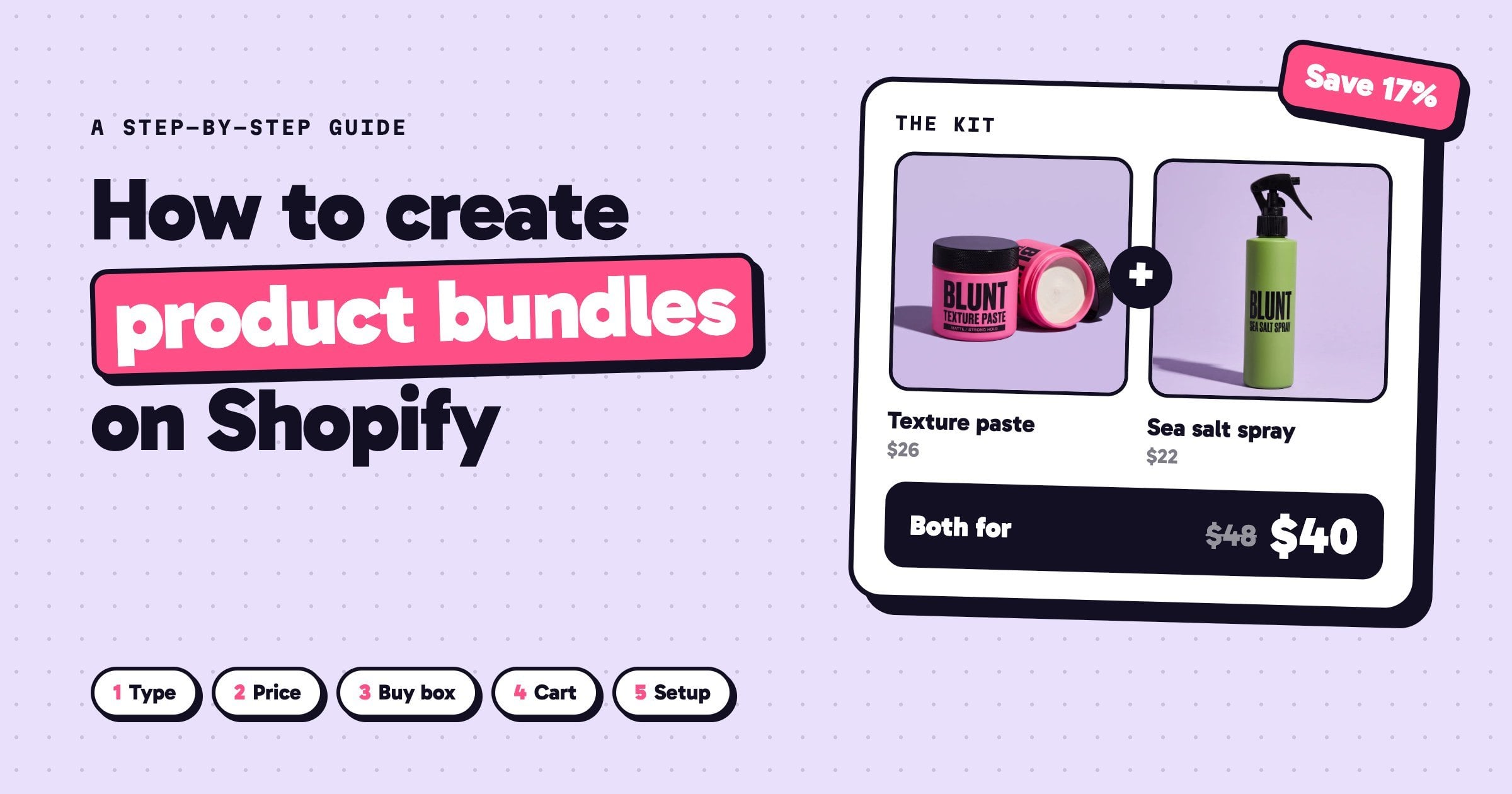
How to create product bundles on Shopify (and price them so you still make money)
How to create product bundles on Shopify: pick the right type, price it so you keep your margin, show it where shoppers decide, and set it up step by step.
Read the guide →
· 6 min read
How to build a Shopify store with AI, step by step
Build a Shopify store with AI, step by step: write a prompt that works, pick a design direction, add bundles and upsells, then launch and read the funnel.
Read the guide →